Movie Posters and Promotional Materials
Twilight Drive-In Double Feature
Scope
-
Graphic Designer
For this project I created two 1950s style movie posters with promotional materials for a drive-in movie theater. The primary problem solved was establishing a cohesive style across materials and ensuring promotional work would be applicable to print and digital interfaces.
-
Illustrator
-
Print Design
-
Video Editor
Movie Poster and Promotion Double Feature
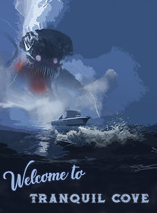
'Welcome to Tranquil Cove'
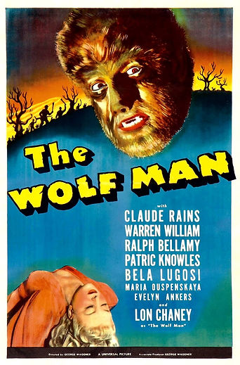
For movie #1 I wanted to explore the aesthetics and storytelling implemented in 1950s monster movie posters. Establishing a setting and the monster's core attributes were my first explorations.

Inspiration
'Welcome to Tranquil Cove' is inspired by the old monster movies of the 40s and 50s. I initiated research by taking notes of the aesthetics and world building utilized in horror poster of the era. Scale of the movie monsters compared to human subjects and elements of world building through setting were most prominent features in early references.


Initial Concept
Inspired by Lovecraftian horrors and the mystery of the sea at night, I got to work on the monster. I knew a limited monochromatic color pallet with small uses of complimentary colors would help with the mystery of the piece and areas to provide focus. The conceptual interplay between lightning and the electrical synapsis of the brain was my initial concept. The creature having an exposed and enlarged brain was my next step to render out further.

_edited.jpg)
Final Poster

Movie Poster and Promotion Double Feature
'Why Does the Caged Bird Sing?'
For movie poster #2, I wanted to explore the aesthetics, mood, and use of color commonly seen in 50s and 60s Italian movie posters. The initial concept was a thriller drama with a female protagonist.
Inspiration
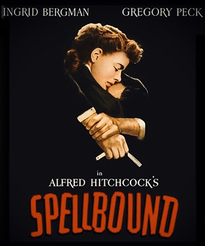
Initial inspirations were noteworthy for their limited color pallets, balance of illustration and typography. The use of silhouettes to provide focus to detail and provide typography with empty space to occupy also was a prominent application in these compositions.


Initial Concept
I felt a looser approach to ideation would fit this poster design. I opted for exploring gesture and abstraction in pencil to inspire and inform future design decisions. For this poster I knew mood and drama would be essential to indicate the story and abstraction would provide visual intrigue.
_edited.jpg)

Final Poster

Final Designs
Double Feature Promotional Bumper
Double Feature Promotion Poster

Movie Poster Promotions


